Why Is Colored Glass Popular in Modern Design?
Colored glass has emerged as a captivating trend in modern design. Its rich hues and versatility create stunning visual appeals. "Colored glass offers a unique way to personalize spaces," says Emily Hart, a renowned expert in glass design. Her insight reflects the growing interest in integrating art with functionality.
The allure of colored glass lies in its ability to transform ordinary environments. Whether used in furniture, lighting, or decor, it adds character. The play of light through colored glass creates dynamic atmospheres. However, some designs face challenges in durability and maintenance. The balance between aesthetics and practicality is critical.
Moreover, the emotional response elicited by color is profound. It can evoke feelings of warmth, calmness, or energy. Yet, not every choice in colored glass yields the desired effect. Thoughtful consideration is essential when selecting colors and applications. As the industry evolves, consumers and designers must remain open to reflection and innovation.
The Historical Significance of Colored Glass in Art and Architecture
Colored glass has a rich history in art and architecture. It has been used for centuries to convey emotions and tell stories. Think of stained glass windows in cathedrals. They capture light in vibrant hues, creating a mystical atmosphere. The colors represent themes like divinity and enlightenment. Each piece of glass plays a role that shapes the viewer’s experience.
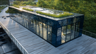
In modern settings, colored glass makes a comeback. Architects and designers draw from history, but they experiment with new forms. Large, colorful panels now grace offices and homes. They can influence mood, energy, and even productivity. It might seem superficial, but light and color engage our senses deeply.
However, there’s a risk. Overuse can lead to a garish and overwhelming space. It's a delicate balance to maintain harmony. Reflecting on its use can lead to more thoughtful design choices.
Modern Aesthetic Trends Embracing Colored Glass in Interior Design
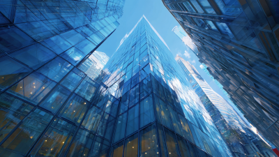
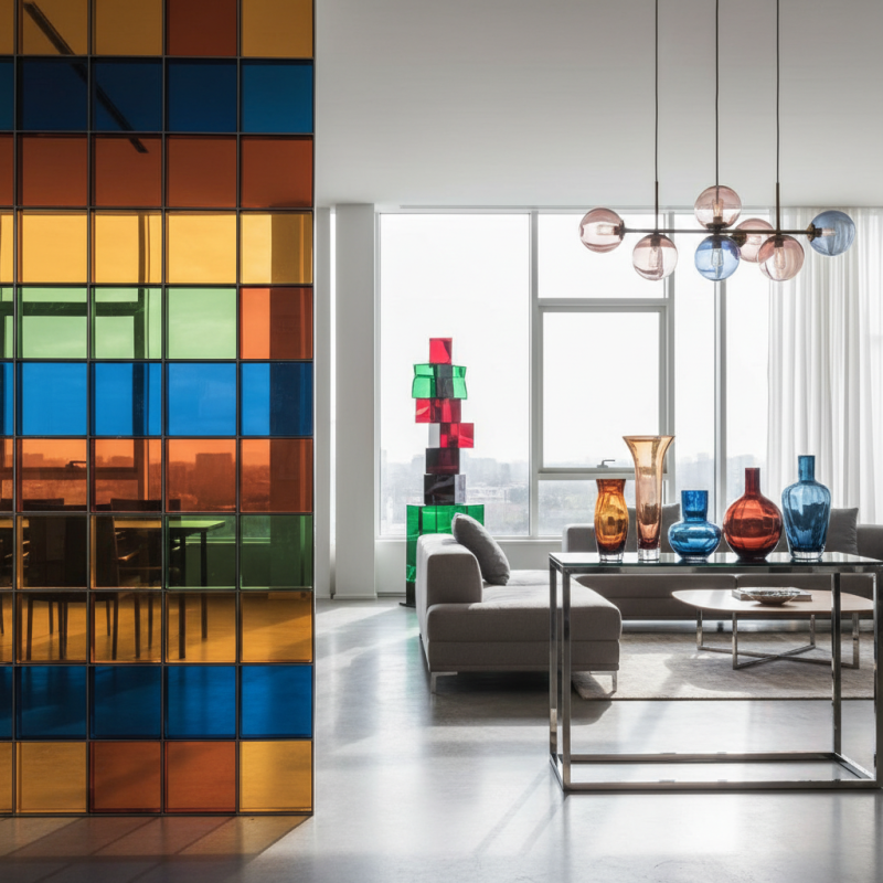
Colored glass has become a fascinating element in modern interior design. It adds vibrant splashes of color to any space. Designers embrace this medium for its ability to transform light. Sunlight passing through colored glass creates beautiful reflections. These reflections can change throughout the day, bringing life to a room.
Incorporating colored glass into interiors can be a delicate balance. It can enhance a space or overwhelm it. Choosing the right colors is critical. A soft blue can bring calm, while a bold red can energize. Understanding the effect of color on mood is essential. Many designers experiment with different shapes and textures. Unique designs often become focal points in a room.
However, challenges exist with colored glass. It can be hard to pair with other elements. Sometimes, it clashes with existing decor. Not every color scheme supports its use. Designers need to play with contrast and harmony. Reflection can be tricky; too much glare can be uninviting. Balancing these factors often requires a keen eye and thoughtful planning.
The Psychological Impact of Color in Glass on Human Perception
Colored glass is gaining traction in modern design due to its unique ability to influence human perception. Colors are not just aesthetic choices; they evoke emotions. Research reveals that 90% of snap judgments about products happen within 90 seconds. Color accounts for up to 85% of this decision-making. Bright hues often stimulate creativity, while cooler tones can foster calmness. This correlation profoundly shapes environments like offices and homes.
Architects and designers utilize colored glass to enhance emotions. A study shows that red can enhance energy, while blue promotes tranquility. Balancing these colors is crucial. Too much of one hue can lead to overwhelming sensations. For instance, overly bright glass can cause anxiety, diverting focus instead of fostering a sense of peace. While the interplay of colors in glass can create stunning visuals, it’s essential to reflect on the psychological effects. A thoughtful approach can foster a harmonious environment, enhancing well-being and productivity.
Psychological Impact of Color in Glass Design
Functional Uses of Colored Glass in Contemporary Design Applications
Colored glass is gaining traction in modern design for its unique blend of form and function. Designers use it in windows, light fixtures, and decorative items. The way light interacts with colored glass creates stunning visual effects. For instance, a blue-tinted glass panel can transform a room, flooding it with soft, diffused light.
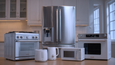
Beyond aesthetics, colored glass serves practical purposes. It can be used for privacy while allowing natural light to filter through. In kitchen designs, colored glass backsplashes make a striking statement. They offer easy maintenance and resist stains. However, certain colors may show fingerprints more than others, prompting designers to think carefully about usability.
In commercial spaces, colored glass can enhance branding. It reflects a company’s identity while providing functionality. The challenge lies in balancing style and practicality. Not all colors work well in every environment. Some hues can feel overwhelming or distracting. Designers must consider the overall atmosphere and purpose of the space.


 Phone
Phone Send Email
 whatsapp
 Facebook